Colt Data Centre Services is a leading carrier neutral data centre operator.
We are trusted by our globally recognised customers to provide unparalleled service and security. Our operational excellence is verified by achieving one of the highest possible scores in the Uptime Institute’s Management and Operations award.
Our brand is unique and stands out from the crowd and the personality and people behind the brand brings it to life. These guidelines show a vibrant and dynamic brand going forward and is here to help you deliver clear and consistent communications, remember, keep it:
- Clean – keep it minimal, avoid overusing elements or the amount of content in communications
- Clear – We’re friendly, knowledgeable and brave in our tone of voice and we use clear typographic hierarchies to communicate clearly
- And fresh – Using our brighter, fresher colour palette and plenty of white space and authentic imagery to convey a dynamic and connected business
If you’re not sure or have any questions, you can always get in touch with us directly, by contacting Adeela Mahmood or Laxmi Daswani.
The Colt DCS Marketing Team
Our brand
Having a consistent brand helps us to bring every element of our DNA together, driving our purpose and getting us closer to achieving our vision.
Aspiration
We aspire to our customers’ success, ensuring your growth is supported by the best infrastructure solution for your business
Innovation & design
We have designed, built, managed and innovated data centres for more than 15 years
Operational excellence
Our certified operational excellence has years of experience to deliver globally-scalable data centres in a highly dynamic IT environment
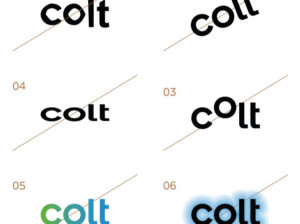
Logo use
The Colt Data Centre Services logo
It is important that the Colt Data Centre Services logo is reproduced consistently across all communication materials. The logo should not be altered in any way and legibility of the logo should always be ensured. Typical uses of our logo are:
- Our logo is primarily used with the Colt Teal on a White background
- The grey logo should be used when the teal logo cannot be used, for example in black and white printing or in certain sizing
- If the logo is placed on imagery, ensure that the logo is clear with a good contrast to the background and away from busy background areas of the image
- The Colt Data Centre Services logo works reversed out with the Colt Teal and all our supporting colours, but ensure legibility is suitable for the intended application(s)
- The Colt Data Centre Services can be used in teal, grey and white only
Artworks of all versions have been created for both print (CMYK) and screen (RGB) use.
Clear space
Please keep the space above, below and adjacent to the logo clear of other graphic elements, images and document edges. This allows the logo to be read clearly without confusion.
The amount of clear space is equal to the size of the 'o' in the logo.
Position, print
When designing for print our logo should be on the top left or right corner of the page. If required the logo can also be placed on the bottom left or right corner.
Position, digital
When designing for digital, our logo is placed in the top-left corner.
What not to do
As a general rule of thumb, if you don't see an example within this brand book, it's probably not allowed. Please don't…
- Redraw, retype or source our logo online
- Rotate or flip the logo
- Reorder / move the letters
- Stretch or distort our logo
- Recolour / use non-brand colours
- Add additional effects to our logo
Co-branding
Lockups & partner logo sizing
Using the Colt Data Centre Services logo with other logos is simple, but there are a few steps to follow, shown on this page.
If you need a new lockup created, please contact the marketing team.
The partner logo should look the same size as our logo.
A tall thin logo would be shrunk until its height or overall visual footprint is the same as our logo.
Similarly a short, wide logo would be shrunk until its width is the same as our logo.
Typography
Our fonts
Gotham is our primary font, to be used across all Colt communication and marketing materials.
When a system font is required – for example in email, or Powerpoint and Word documents sent to clients and partners – then Arial should be used.
Gotham is available for purchase from Typography.com. It is available for use on the web as part of the cloud typography service from Hoefler&Co.
For Japanese font alternatives, please use Meiryo UI.
Typography in use and hierarchy
Our primary font, Gotham, includes 4 weights: Light, Book, Medium and Bold.
The preferred and most used combination of weights is Light and Medium.
To create a consistent experience for the reader use:
- Light — for body copy, section headings and pull-outs
- Medium — for sub-headings
- Book and Bold — for extra emphasis or highlights if needed to help with the legibility and hierarchy
When using our fonts, ensure there is a clear hierarchy to help the reader navigate communications.
Do not add any effects to the text, such as glow or drop shadow.
For Japanese font alternatives, please use Meiryo UI.
Gotham
Connectivity matters: light
Connectivity matters: book
Connectivity matters: medium
Connectivity matters: bold
Arial
Connectivity matters: regular
Connectivity matters: bold
Typography, in use
When using Gotham, stick to the same sizes and style to create a consistent experience for the reader. Do not add any effects to the text, such as glow or drop shadow.
Headings weight 01
gotham light
Lorem ipsum dolor
Headings weight 01
gotham medium
Lorem ipsum dolor
Headings weight 01
gotham bold
Lorem ipsum dolor
Below are a few font pairings and layouts that follow this advice:
Text pairing 01
light + medium
Gotham light. Colt leads the way in enabling your digital transformation through agile and on demand, high bandwidth solutions.
Gotham medium. Colt leads the way in enabling your digital transformation through agile and on demand, high bandwidth solutions.
Text pairing 01
book + medium
Gotham book. Colt leads the way in enabling your digital transformation through agile and on demand, high bandwidth solutions.
Gotham medium. Colt leads the way in enabling your digital transformation through agile and on demand, high bandwidth solutions.
Text pairing 01
medium + bold
Gotham medium. Colt leads the way in enabling your digital transformation through agile and on demand, high bandwidth solutions.
Gotham bold. Colt leads the way in enabling your digital transformation through agile and on demand, high bandwidth solutions.
Text style
When writing copy, there are a number of style rules that should be adhered to, we've detailed and illustrated each of these rules:
Use sentence case for titles and headings
Do not place a full stop after headings and bulletpoints
Please use correct bullet points
Typography colour
When using standard body/paragraph text, please use black for legibility. While you are free to use the Colt Teal for headings or other areas where text is larger/heavier, please consider accessibility & readability.
Colours
Primary colours
We have refreshed our primary colour to be bolder and more vibrant, it should be used alongside plenty of white space.
Colt Teal should always be included in communications in some way, whether that is in the logo, graphics or typography, especially when using any of the supporting colours – we are, after all, known for our Teal.
Colt Teal
Pantone 3265
CMYK 70 0 40 0
RGB 0 215 189
HEX #00D7BD
White
Pantone n/a
CMYK 0 0 0 0
RGB 255 255 255
HEX #ffffff
Secondary colours
Our supporting colour palette is for use in the stream graphic (as detailed in the next section), text, tables, diagrams, charts, and other information design.
These colours should always support the primary Colt Teal.
Colt Blue
Pantone 2727
CMYK 85 24 0 0
RGB 0 153 255
HEX #0099FF
Colt Purple
Pantone 2607
CMYK 83 99 0 2
RGB 80 0 145
HEX #50009B
Colt Yellow
Pantone 2607
CMYK 0 24 100 0
RGB 255 196 61
HEX #FFC43D
Colt Pink
Pantone 2040
CMYK 0 95 45 0
RGB 239 71 111
HEX #EF476F
Colt Dusk
Pantone 3272
CMYK 94 0 48 0
RGB 0 165 155
HEX #00A59B
Colt Ash
Pantone n/a
CMYK 0 0 0 5
RGB 245 245 245
HEX #F5F5F5
Colt Charcoal
Pantone 432
CMYK 15 15 15 75
RGB 72 74 71
HEX #484A47
Black
Pantone n/a
CMYK 0 0 0 100
RGB 0 0 0
HEX #000000
Colour proportion
When creating a layout and employing the Colt colour palette, it is important to keep in mind the proportion of the brand colours you use. Colt teal or white should be the dominant colours in any layouts, followed by the other secondary colours. The graphic below is designed to show the relative colour proportions between the secondary and primary colours in a given layout.
Although individual pieces may vary, notice that the cumulative effect keeps the overall brand balance.

Stream graphic
The stream graphic is a born out of the wordmark, and symbolises connectivity and performance. Powerful connectivity creates powerful experiences.
The stream graphic symbolises:
- Connections
- Connectivity
- Performance
- Data flow
- Energy
Creating the stream graphic
The stream graphic consists of a ‘line’, a ‘circle’, and a ‘ring’. These elements are set on a grid of 60 degrees – the direction and angle of this should never be changed.
Only one colour should be used along any one path, with a choice/combination of line, circle, or ring. The shapes on one path can overlap.
A template file is available to download for creating new compositions. The grid is on a non-printing layer and should never be visible in the final design.
The grid

A path on the grid

The stream graphic on the grid

Final stream graphic (without grid)

Colouring the stream graphic
The stream graphic uses the primary and supporting colour palette, set to 100%, 60%, or 30% transparency.
Only one colour should be used along any one path, and the transparency of the line, circle and ring should vary to create a sense of flow.
100%
60%
30%
Scaling the stream graphic
The stream graphic can be used at different scales. When scaling the stream graphic template up or down, please ensure the grid and graphics are scaled proportionately, and that all the lines, circles, and rings are of the same size.

Using photography with the stream graphic
There are 3 ways to combine photography and the stream graphic:
- The stream graphic can be used over full bleed photography. The colour and the position of the stream graphic should complement the photography. Ensure the stream graphic does not cover faces, or any other important features in the image.
- Subject matter can be cut out and stream graphic overlaid as per the first treatment.
- Imagery can be set within a stream shape (excluding the ring) and used at a larger scale. This is the only time it can be used at a larger scale than the coloured stream graphics.

What not to do
When creating a new stream graphic composition do not:
- Leave out the use of Colt Teal
- Use the stream graphic in transparencies other than 100%, 60%, 30%
- Use multiple colours on the same path
- Put two solid circles overlapping, one should always be a ring
- Use the same transparency for either the line, circle, or ring when overlapping the shapes
- Use multiple scales of the stream graphic in the same composition
- Obscure the focal point in imagery
- Change the direction of the lines


Photography
Primary photography
When selecting photography it should be:
- Positive, friendly, and energetic
- Authentic, not posed or obviously staged
- Reflective of genuine connections and engagement
Our photography style is:
- Bright and fresh, using natural light as much as possible
- Complementary to our colour palette
- Uncluttered with a sense of space
- Slightly desaturated to feel more authentic


Supporting photography
There are times when more descriptive and functional supporting images are required, these should only be used at lower levels, such as within a document to support content or in lower level modules on a website.
These photographs should also follow our photography style:
- Bright and fresh, using natural light as much as possible
- Complementary to our colour palette
- Uncluttered with a sense of space
- Slightly desaturated to feel more authentic


What not to do
Do not use photography that:
- Is overly conceptual and cliché
- Lacks a clear purpose and focus
- Is overly posed
- Is a poor composition or badly cropped
- Is of poor quality or pixelated
- Shows disengaged people
- Has unnatural colouring of skin tones or overall image


Iconography
We have an extensive icon library that has been produced with lots of people across the business, so we should have something to meet your needs.
Please do:
- use icons in appropriate places to illustrate content in the adjacent paragraph
- keep consistent heights for each icon
- use consistent clear space around the icon
Please don't
- edit or alter the icons
- overlap icons with text
- over-use the icons in one context
Examples


![]()
Can't find what you need?
If there is something you need but cannot find, or if you have a new requirement, then please contact the Brand Team. We manage the icon library centrally so we can limit duplication. This way we can make sure everyone is using our icons correctly, repeatedly and consistently. We regularly check with the business to see if there are new icon needs, so if you want to be consulted about icons please drop us a note.
Have a question?
Have a question about something not mentioned in any of our brand guidelines? Send us a question via email and we'll get back to you as soon as we can - Adeela Mahmood or Laxmi Daswani.